This is a collection of my in-house merch design projects done through my previous employer, Ambient Inks a screen printing company serving clients across Wisconsin, from regional brands to local festivals. I worked as a graphic designer there, conceptualizing and designing apparel across their client roster alongside my prepress managment job.
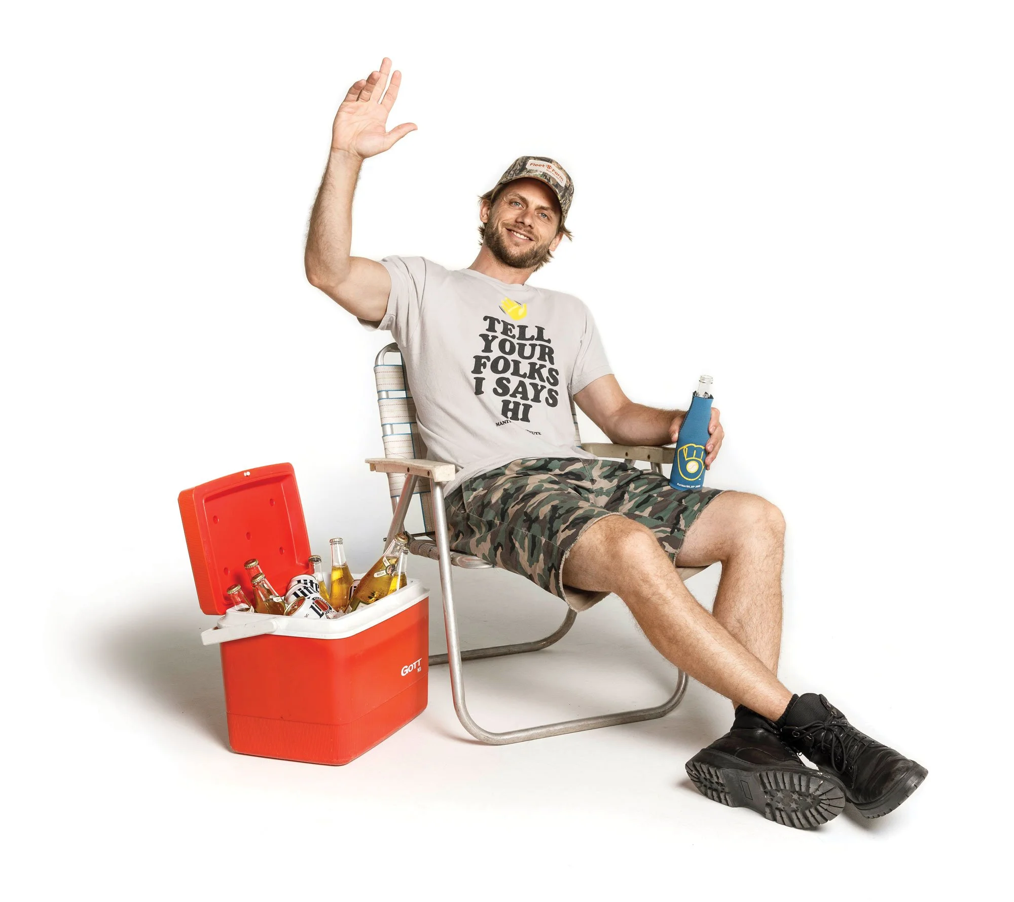
Photo by Sara Stathas
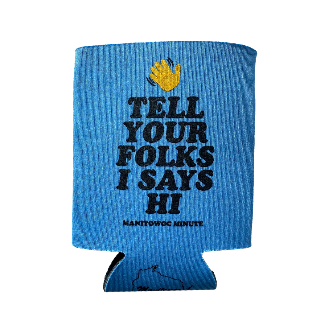
Tell Your Folks I Says Hi: A Midwest Saying Turned Bestseller
Turning a phrase every Wisconsinite has heard a hundred times into the client's top-selling design.
Role
Concept | Typography | Layout | Illustration
Client
Manitowoc Minute, a Wisconsin-based comedy and media brand built around regional Midwest humor.
Brief
Design a tee around a phrase that would feel instantly familiar to the client's Midwest audience, one that could work as a standalone piece of merch without needing extra explanation.
Concept
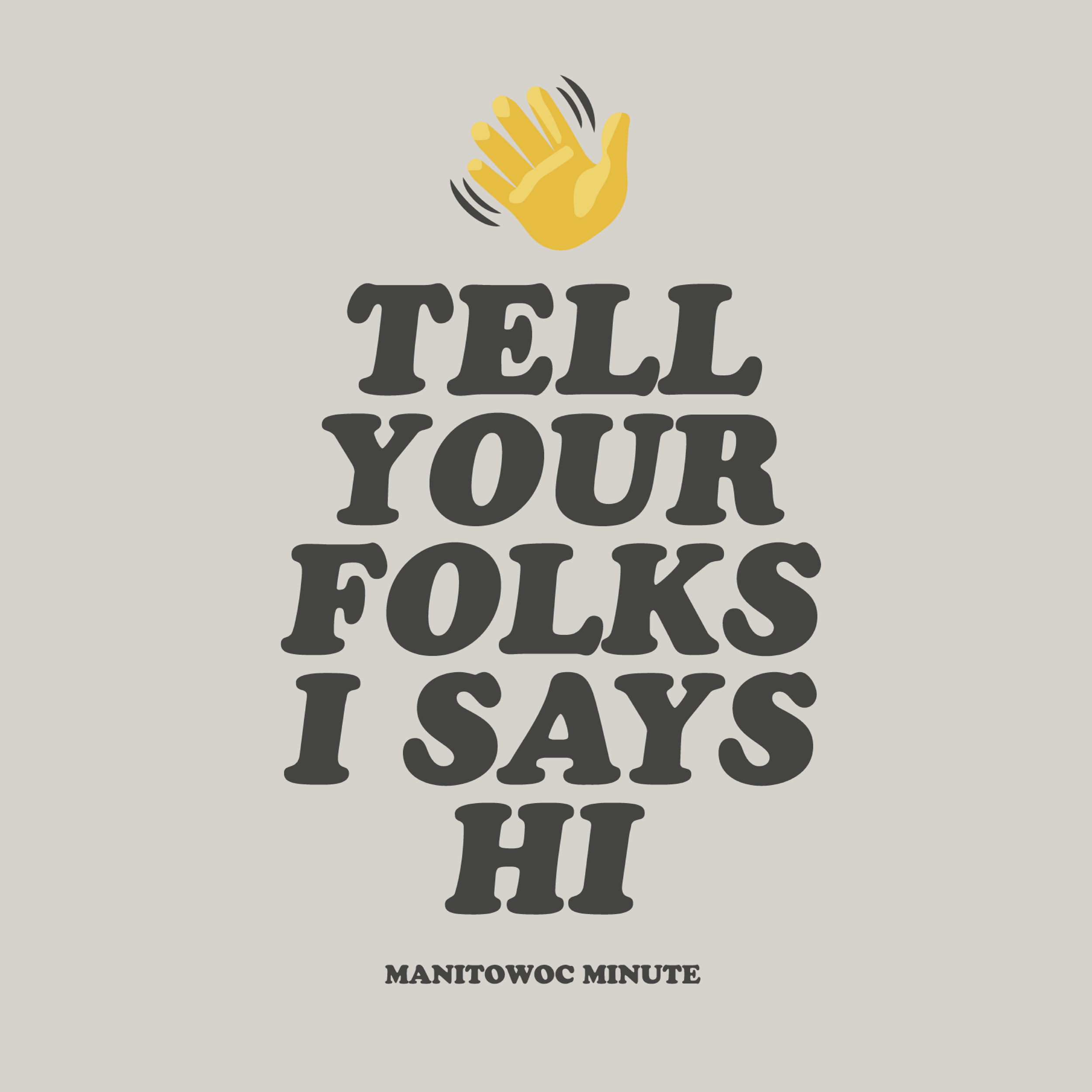
"Tell your folks I says hi" is a classic bit of Midwest, and specifically Wisconsin, small talk. It's the kind of thing you'd hear from a neighbor or a grandma, said without a second thought. The design leans on that built-in familiarity rather than trying to invent a joke. Oversized, chunky type carries the whole thing, so the phrase itself does the work, and a simple waving hand icon on top reinforces the "hi" without adding any competing imagery.
Collaboration
Worked directly with the client's team to make sure the hand-lettering style and tone matched how their audience actually talks (warm, plainspoken, a little folksy) rather than playing the phrase as a punchline.
Deliverables
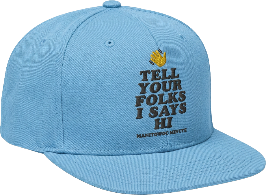
Primary merch design, plus adapted versions for tees, crewnecks, hats, stickers, and can cozies.
Outcome
Became one of the client's best-selling pieces of merch of all time, and has stayed in active rotation across multiple product types since launch.
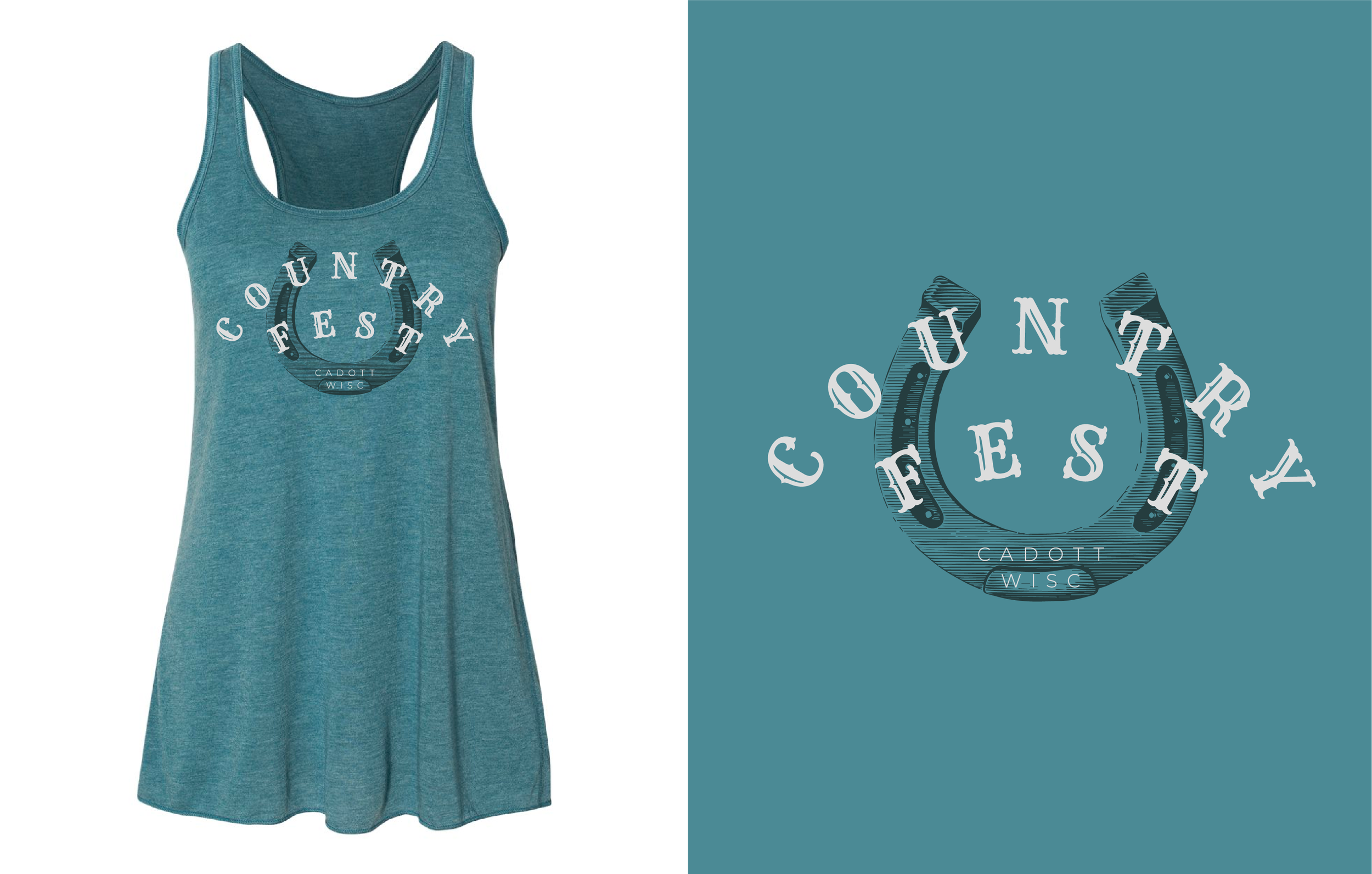
Client: Rock Fest & Country Fest
Cadott, Wisconsin
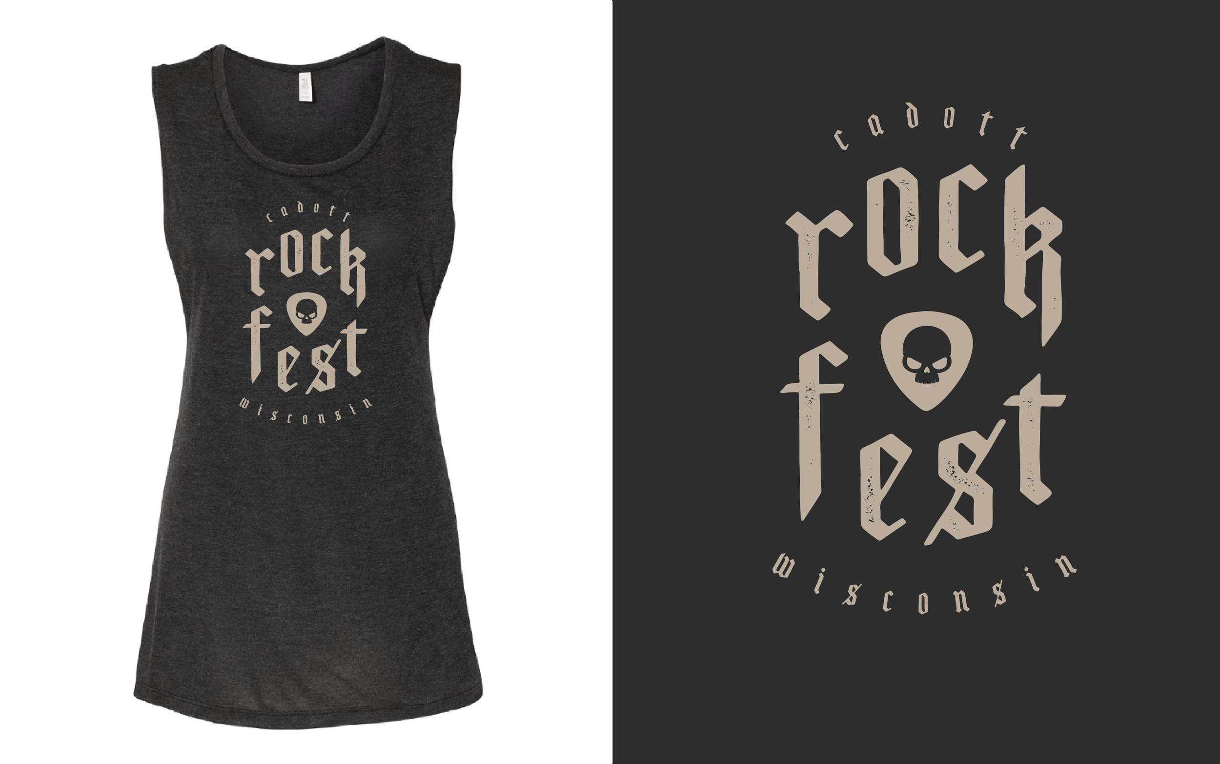
Approached by their team to create more feminine merch options for the festivals' ongoing collection. rock fest got a bold, gothic-inspired type treatment with a skull mark, while country fest used a softer horseshoe lockup, giving each event its own identity within the same collection. left both designs undated by intent, so they could be reprinted and resold in future years without going stale.

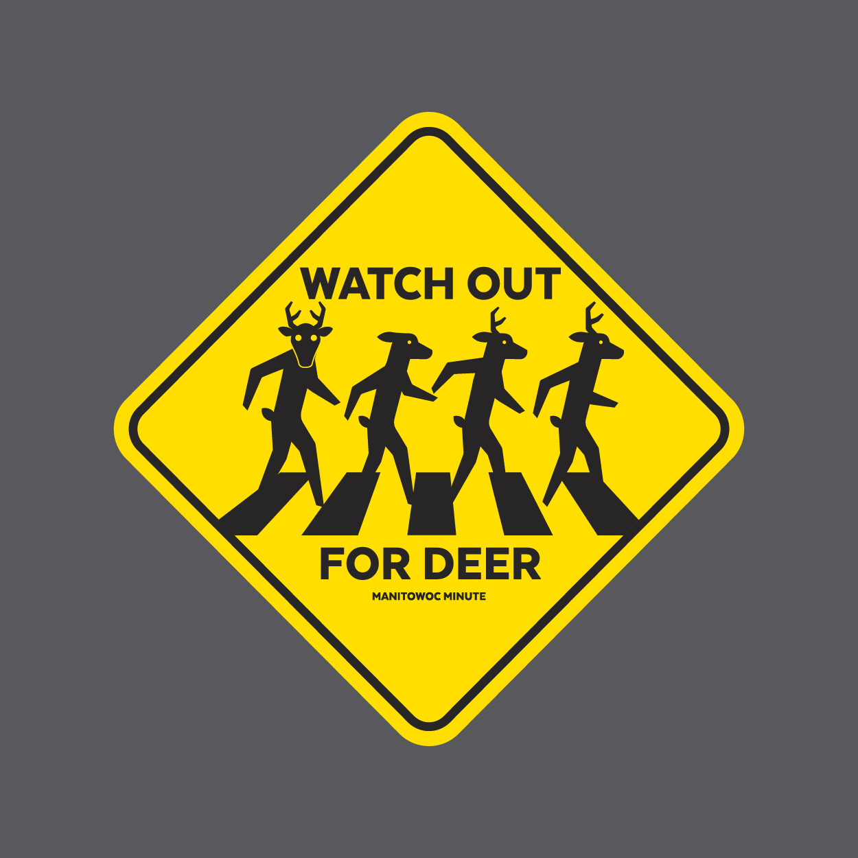
Watch Out for Deer: A Midwest Goodbye, Illustrated
Taking a phrase every Midwest parent says at the door and turning it into a literal road sign.
Role
Concept | Typography | Layout | Illustration
Client
Manitowoc Minute, a Wisconsin-based comedy and media brand built around regional Midwest humor.
Brief
Create a second merch design to sit alongside "Tell Your Folks I Says Hi," pulling from another piece of everyday Midwest language the client's audience would immediately recognize.
Concept
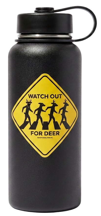
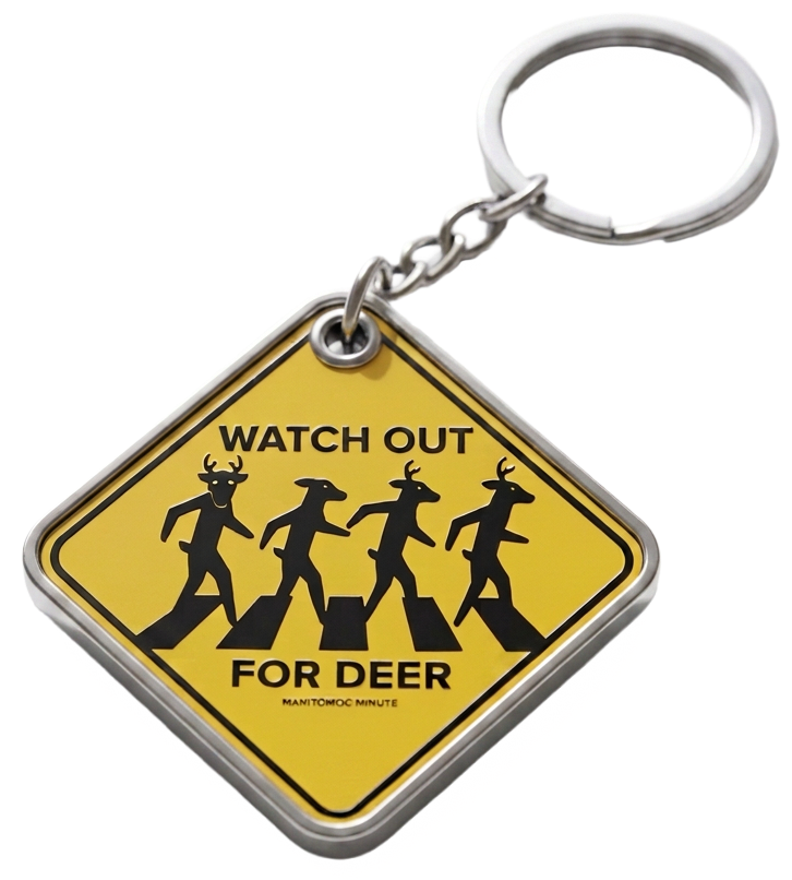
"Watch out for deer" is what Midwest parents say to their kids on the way out the door, especially after a visit home, as a stand-in for "drive safe" or "goodbye." The design plays that phrase completely straight by rendering it as an actual yellow road sign, then adds a second layer of humor by populating the sign with deer walking in the Abbey Road crosswalk pose. The joke works on two levels at once: the phrase itself, and the visual reference layered on top.
Collaboration
Developed the wordplay and the illustration approach with the client's marketing team to make sure both the phrase and the Abbey Road reference would land with their audience without over-explaining either one.
Deliverables
Primary tee design, plus an adapted version as a standalone road-sign graphic for stickers and other merch.
Outcome
Became another best-selling design for the client, sitting alongside "Tell Your Folks I Says Hi" as one of their top-performing pieces.

Collaboration
Pitched a split fountain screen print technique to cut per-color cost while keeping the design's color richness.
Deliverables
Tee and pint glass illustration system, print-ready with split fountain technique.
Outcome
Selected as Spritzen's debut launch merch, meeting budget constraints while preserving the color concept that won the pitch.
Leinenkugel's Spritzen: Designing for a Product Launch
Winning the pitch for a brand new product line, then solving a print budget problem without losing the design's energy.
Role
Concept | Illustration | Print technique
Client
Leinenkugel's
Brief
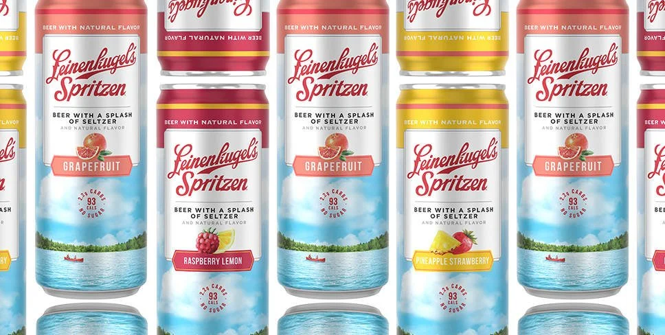
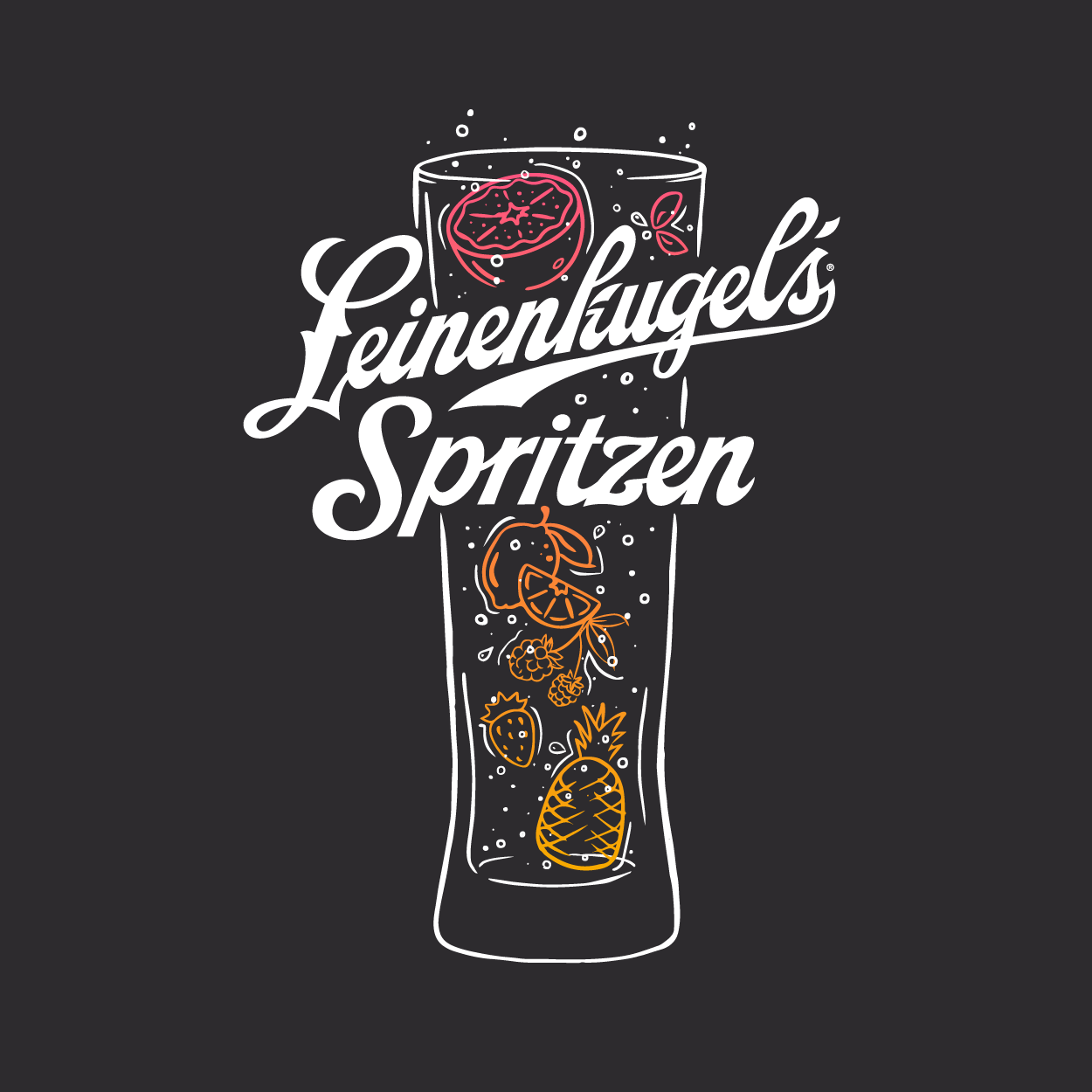
Create merch design for Spritzen's beverage debut, showcasing three flavors in a way that felt fun and matched the drink itself.
Concept
built around fruit and color, giving each flavor its own identity inside one illustrated pint glass. selected from a dozen concepts.
Additional apparel design
Client: Leinenkugel's
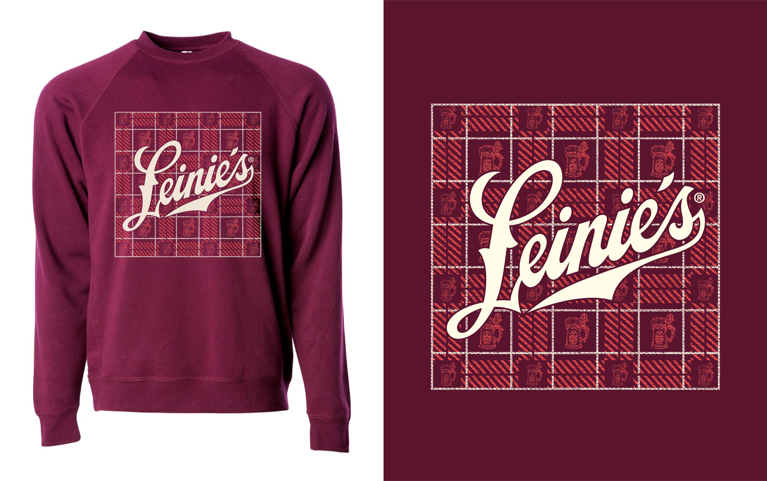
Pitched as part of an autumn-themed concept round for Leinenkugel's, built around the feeling of the season: plaid blankets, campfires, and an Oktoberfest stein.
Merged those references into a single plaid-based crewneck design, using the plaid pattern itself as the dominant graphic rather than as a background element.